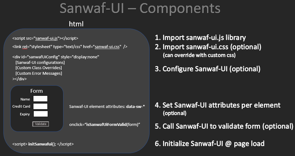
| 1. |
Import sanwaf-ui.js lib |
| <script src="sanwaf-ui.js"></script> |
| this makes the Sanwaf-UI code available for use on your page |
|
| 2. |
import Sanwaf-UI CSS (optional) |
|
| 3. |
Configure Sanwaf-UI (optional) |
| add a hidden element named "sanwaf-ui-config" & configure Sanwaf-UI |
| if you want to override Sanwaf-UI defaults, this element must be declared |
|
| 4. |
Set Sanwaf-UI attributes per element |
| <input | type="text" id="carModel" size="20" |
| data-sw-display="Car Model" |
| data-sw-type="s" |
| data-sw-max-length="30" |
| data-sw-min-length="0" |
| data-sw-required="true" |
| data-sw-related="haveCar:Yes" |
| data-sw-err-msg="Car Model must be entered if you own a car" |
| /> | <!-- see below for Sanwaf-UI attribute details --> |
|
| 5a. |
Call Sanwaf-UI method to validate form |
| isSanwafUiFormValid(form) | checks the elements on a form for errors. returns true/false |
| sanwafUiBlurElement(element) | performs validate on the element specified. returns true/false |
|
| 5b. |
OR Call Sanwaf-UI method to get errors in JSON format |
| sanwafGetFormErrors(form) | checks the elements on a form for errors. returns all errors found in JSON format |
| sanwafGetElementErrors(element) | performs validate on the element specified, returns errors found in JSON format |
|
| 6. |
Initialize Sanwaf-UI |
| <script> initSanwafui(); </script> |
| script scans page for Sanwaf-UI attributes setting events on elements |
|
| Attribute | Description |
| data-sw-num-errors-to-display | Number of error messages to display. Specify -1 to display all errors
Defaults to: -1 |
| data-sw-error-actions | Action(s)s to take when an error is found on a submit
Defaults to: hoverOnLabel,hoverShowLabel,colorLabel,colorInput |
| data-sw-blur-actions | Action(s) to take when a field is blurred
Defaults to: hoverOnLabel,hoverShowLabel,colorLabel,colorInput |
| data-sw-show-on-page-element-id | Optional element to wrap the Sanwaf-UI errors that will be made visible if errors are detected
Defaults to: sanwafuierrorwrapper |
| data-sw-show-on-page-sanwaf-element-id | Optional element to set a table of Sanwaf-UI errors (configurable by css)
Defaults to: sanwafuierrortable |
| Attribute | Description |
| data-sw-label-class | Sets the color for the label of the error'd element |
| data-sw-input-class | Sets the color of the input text of the error'd element |
| data-sw-tooltip-class | The tooltip css class applied to the label |
| data-sw-tooltip-text-class | Tooltip text css specification |
| data-sw-sanwaf-error-table-class | When displaying errors on the page, a table in inserted using this css class |
| data-sw-sanwaf-error-table-td-key-class | The css class for the key section of the Sanwaf-UI error table |
| data-sw-sanwaf-error-table-td-desc-class | The css class for the value section of the Sanwaf-UI error table |
| Attribute | Description |
| data-sw-error-pop-header1 | header line 1 used with pop-up dialog |
| data-sw-error-pop-header2 | header line 2 used with pop-up dialog |
| data-sw-error-required | Error message for Required violations |
| data-sw-error-max-length | Error message for Max Length violations |
| data-sw-error-min-length | Error message for Min Length violations |
| data-sw-error-maxmin-length-equal | Error message for when Min & Max length are equal |
| data-sw-error-max-value | Error message for Max Value violations |
| data-sw-error-min-value | Error message for Min Value violations |
| data-sw-error-related | Error message for Relationship equality violations |
| data-sw-error-related-not-equal | Error message for Relationship violations |
| data-sw-error-type-char | Error message for Character data type violations |
| data-sw-error-type-numeric | Error message for Numeric data type violations |
| data-sw-error-type-numeric-delimited | Error message for Numeric Delimited data type violations |
| data-sw-error-type-integer | Error message for Integer data type violations |
| data-sw-error-type-integer-delimited | Error message for Integer Delimited data type violations |
| data-sw-error-type-alphanumeric | Error message for Alphanumeric data type violations |
| data-sw-error-type-alphanumeric-and-more | Error message for Alphanumeric and more data type violations |
| data-sw-error-type-constant | Error message for Constant data type violations |
| data-sw-error-type-regex | Error message for Regex data type violations |
| data-sw-error-type-format | Error message for Format violations |
| data-sw-error-type-dependent-format | Error message for Dependent Format violations |
| Action | Description |
| hoverOnLabel | Add a hover element to you label that is associated with the 'for=' attribute of the label
The hover is configurable via the .sawafuiTooltip elements in the sanwafy-ui.css file |
| hoverShowLabel | Include the associated label text in the hover message |
| colorLabel | Change the color of the label to the value specified in the .sanwafuiLabel css configuration in the Sanwaf-UI.css file |
| colorInput | Change the color of the input element to the value specified in the .sanwafinput css configuration in the Sanwaf-UI.css file |
| showOnPage | Element id to be made visible if an error is detected (to provide custom message) |
| showOnPageSanwafTable | Element id to insert the Sanwaf-UI table of errors |
| alertWithPopup | Show an alert dialog containing the Sanwaf-UI errors |
| Attribute | Description |
| data-sw-display | Name Associated with the widget that will be used for display in error messages. |
| data-sw-label-id | Id of Label associated with the element that will be used for errors (change color & tooltips).
if not provided, Sanwaf uses the label's 'for' attribute. |
| data-sw-type | Data type of the element |
| data-sw-required | Makes the element a mandatory field |
| data-sw-mask-err | The a value you want to mask the entered value with for when you want to hide it from being displayed in an error message (passwords...) |
| data-sw-max-length | Maximum character limit |
| data-sw-min-length | Minimum character limit |
| data-sw-max-value | Maximum value for the given type. User will not be able to enter a value greater |
| data-sw-min-value | Minimum value for the given type. User will be able to enter a lower value (as you need to enter a '1' then a '0' for 10...), however, upon leaving focus, an error condition will be triggered if less than the min setting |
| data-sw-related | Relate fields. format: [related-to-element:type] where type is '=' or 'value' |
| data-sw-err-msg | Custom error message (overrides global msgs) |
| Data Type | Description |
| Character (c) |
| Description | Any single character |
| Format | c |
| Example | y, n, a, b... |
|
| Numeric (n) |
| Description | Any positive or negative numeric value
('+' sign NOT allowed; one '-' sign allowed @start of value; no spaces; one '.' allowed)
Note: 00001 is a valid number |
| Format | n |
| Example | 1000, -321.123, 0.0001 |
|
| Delimited list of numbers (n{}) |
| Description | A character separated list of numbers |
| Format | n{<separator char>}
Note: the min & max settings applies per delimited value
Note: 00001 is a valid number |
| Example | using n{,}, -321.123,0.000,123,45 |
|
| Integer (i) |
| Description | Any positive or negative integer value
('+' sign NOT allowed; one '-' sign allowed @start of value; no spaces)
Note: 00001 is a valid number |
| Format | i |
| Example | 1000, -321, 1 |
|
| Delimited list of integers (i{}) |
| Description | A character separated list of integers |
| Format | i{<separator char>}
Note: the min & max settings applies per delimited value
Note: 00001 is a valid number |
| Example | using i{,}, -321,0,123,45 |
|
| Alphanumeric (a) |
| Description | Valid chars are A-Z, a-z, 0-9 |
| Format | a |
| Example | abcdefghijklmnopqrstuvwxyz0123456789ABCDEFGHIJKLMNOPQRSTUVWXYZ |
|
| Alphanumeric & more chars (a{}) |
| Description | Valid chars are A-Z, a-z, 0-9 *AND* the characters you specify in the curly brackets
For [space], [tab], [newline], [carriage return] use: \s \t \n \r respectively |
| Format | a{<characters to allow>} |
| Example | using a{+\s,}, abcdefghijklm nopqrstuvwxyz+ |
|
| String (s) |
| Description | Any string
All regex's in the autoRunPatterns are executed against the string |
| Format | s |
| Example | "Hello this string does not contain a XSS payload" |
|
| Open (o) |
| Description | Open value
Any string provided, no regex's will run against this data type
designed for password fields where you don't want any restrictions |
| Format | o |
| Example | "Hello this string does contain a XSS payload <script>alert(1)</script>" |
|
| Constant (k{}) |
| Description | Constant, must be equal to one of the values specified |
| Format | k{<comma separated list of strings>} |
| Example | using k{FOO,BAR,FAR}, FOO, BAR, FAR are valid |
|
| Regex (x{}) |
| Description | Custom Regex Expression in this file (for reuse) |
| Format | x{your-regex} |
| Example | |
|
| Format (f{}) |
| Description | Format: Tries to best fit the data entered into the supplied mask |
| Format | f{(###) ###-####} |
| Example | using f{(###) ###-####, (555) 123-4567 is valid |
|
| Dependent Format (d{}) |
| Description | Dependent Format: Tries to best fit the data entered into the supplied mask that is derived from an elements value |
| Format | d{element:value1=format1;value2=format2;...} |
| Example | using d{countr:USA=#####;Canada=A#A-#A#}, 55555 is valid if the element with id or name is equal to USA |
|
| The Format data type sets the element to use a Format | |
| A Format is way to best fit a user's entry into a mask | |
| Sanwaf-UI automatically sets an oninput event handler to elements that have the format data type. the event handler formats as the user enters data | |
| Four special characters are provided to be used in formats: | |
| # | - accepts a number | |
| #[ ] | - accepts a number within a range: #[1-12]
- accepts a number meeting a specified set of values: #[4,5,6]
- accepts a number bound by date settings: #[yy-yy(+10)]
Supported date variables include: yy, yyyy, mm, dd
Format: #[ variable( <+/-> # ) ]
For example: #[ yy( -10 ) - yy( +10 ) ] - accepts a year in 'yy' format in the range of up to 10 years old to 10 years in the future | |
| A | - accepts an Uppercase Alphabetic character | |
| a | - accepts a lowercase Alphabetic character | |
| c | - accepts an Alphabetic character of any case | |
| x | - accepts any character of any case | |
| Use a combination of the special and non-special characters to create formats | |
| To use the four special characters in the format itself, you will need to escape them: | |
| \# \A \a \c \x \[ \] \| | |
| For example, if you want the end user to enter a telephone number formatted in a specific way: | |
| data-sw-type="f{(###) ### - ####}" | |
|
|
|
| if you want the end user to enter a credit card that begins with a specific number: | |
| data-sw-type="f{#[3,4,5,6]###-####-####-####}" | |
|
|
|
| Or, if you want the end user to enter a credit card expiry date within the range of this year to ten years from now: | |
| data-sw-type="f{#[1-12] / #[yy-yy(+10)]}" | |
|
|
|
| | |
| You can also have multiple formats combined into one format field using the 'OR' opperator (||) | |
| For example to use a single field to capture US Zip codes in short & long form, along with the Canadian Postal Code format | |
| data-sw-type="f{##### || #####-#### || A#A-#A#}" | |
|
|
|
| The Dependent Format data type sets the element to use a Format when a different element equals a specific value | |
| Sanwaf-UI automatically sets an oninput event handler to elements that have the dependent format data type. the event handler formats as the user enters data | |
| See the Format Data type for instructions on creating formats | |
| The dependent format syntax is as follows | |
| d{ element : value1 = format1 ; value2 = format2 } | |
| where | |
| element - is the id or name of the element you want to make the format dependent on | |
| value - is the value of the element for the given format to be used | |
| format - is any format as specified it the format data type section above | |
| For example, if you want to use a country element to determine the type of format to apply (zip or postal code): | |
| data-sw-type="d{ country : USA = ##### || #####-#### ; Canada = A#A-#A# }" | |
|
|
|
| The "data-sw-related" attribute sets element relationships. Use this attribute to specify which fields are mandatory based on other related elements | |
| For example, if you want 2 password fields, pass1 & pass2, to equal each other, you would set the "data-sw-related" attribute in pass2 as such: | |
| data-sw-related="pass1:=" | |
| this specifies that pass2 is required if pass1 is populated, and their values must equal each other. | |
| Relationships have a 2 part format: | |
| RelatedToElementPart : RelationshipSpecificationPart | |
| Where "RelatedToElementPart" is the element id of the related field and "RelationshipSpecificationPart" is one of: | |
| For complex relationships, encapsulate the 2 part format with parenthesis's "( RelatedToElementPart : RelationshipSpecificationPart )" and specify the && and/or the || operators | |
| For example: | data-sw-type="( element1 : value1 || value2 ) || ( element2 : value1 || value2 ) && ( element3 : value1 || value2 )..." |
| | |
| Test a few relationships | |
|
|
|
|
|
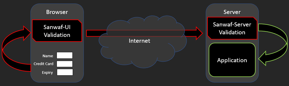
| Sanwaf-Server has 2 options for protecting parameters. Global and Endpoint |
| Global parameter protection protects named parameters globally regardless request URI origin |
| Endpoint parameter protection protects named parameters for a specified set of URIs |
| Endpoints are used by Sanwaf-UI-2-Server when you include the --endpoint option to create the Sanwaf-Server XML file |
| You add the data-sw-actions attribute to specify what endpoints you want related to the form. If not provided, the form's action attribute will be used |
|
| For example: |
| You have 2 URIs: /foo & /bar |
(1) Global parameter protection for "name".
Regardless of request origin (URI), Sanwaf-Server will ensure the parameter is secured based on the data-sw-* attributes specified |
(2) Endpoint parameter protection for "name" for URI /foo.
Sanwaf-Server will ensure the parameter is secured based on the data-sw-* attributes specified only if the URI matches |
|
| Endpoints allow you to have different data-sw-* attribute configurations for identically named parameters in differing URIs |
| For example: |
| /foo?name - can be configured to have a length of 5 |
| /bar?name - can be configured to have a length of 30 |
|
| Endpoints do not apply to Sanwaf-UI but need to be specified on any form where you dynamically set the action attribute |
| If not specified, the form's action attribute will be used which wont work if the action is dynamically set |
| To overcome this, you will need to specify all the possible form actions using the data-sw-actions attribute |
|
| For a given form add the data-sw-action attribute and specify the URIs you want Sanwaf-Server to protect |
| Use the ":::" separator to specify more than one URI |
| For Example: |
| Using the form's action attribute: <form action="/foo"> |
| Not using the form's action attribute: <form data-sw-actions="/foo:::/bar"> |
|
| See the Sanwaf-Server documentation for more information |
| Element | Description |
| sanwafuiLabel | Sets the color for the label of the error'd element |
| sanwafInput | Sets the color of the input text of the error'd element |
| sanwafuiErrorTable | When displaying errors on the page, a table in inserted using this css class |
| sanwafuiErrorTableTdKey | The <td> css class for the key section of the Sanwaf-UI error table |
| sanwafuiErrorTableTdDesc | The <td> css class for the value section of the Sanwaf-UI error table |
| sawafuiTooltip | The tooltip css class applied to the label |
| sawafuiTooltip .tooltiptext | Tooltip text css specification |
| sawafuiTooltip .tooltiptext::after | Tooltip after specification |
| sawafuiTooltip:hover .tooltiptext | Tooltip hover specification |